Sunday 29 April 2012

Self-directed: "Out Of Control - Evaluation

Evaluation

Looking back over my self-directed project, even though I am very pleased with the out come of my flip books, there are few things I would do differently after what I have learnt from it. 

The first thing that I would change would be the weight of the paper, from 170 gsm to 150 gsm, because I found that the flick to the books were a little bit stiffer than I would have wanted. It was also quite expensive to use this paper, so it wasn't a very good choice if I was trying to make a profit from the books.

The next thing I would have changed, now I have a better knowledge of InDesign, would be use the space on the sheets I printed, because there was a lot of empty space on the pages that didn't have a lot of flip book pages on. I think I could have condensed my work from 8 pages of A1 to 7 pages by planning my space better. This would have saved me some money and been more eco friendly.

Another thing that I would have liked to change would be my method of binding. I had planned on stapling the pages of the flip book together in one go with a heavy duty stapler, or in two goes if the books were just a little bit too thick for one go. I went to Staples and they told me that this was achievable, but when I came back after my pages were ready they said that they couldn't do this, in the way I had originally planned. So I made do because of the now limited time I had left and stapled as many as I could together, and glued each section together to make the book. This was difficult to do and to make sure all the pages were aligned. Next time I would just get my prepared pages, drill a hole through them and put a post through it.

One thing I would have done differently when recording the subject would be to make sure that they didn't have the item, that was making them pull that face, in the frame because I feel the reactions were easier to interpret when there wasn't something covering part of their face. Though this would be really difficult to do to the lemon due the sour taste hitting the senses very quickly, unlike the chilli or the onion.

There are some processes I would have to change if I were to make this into a mass produced product. For example, the printing process and the cutting process. I would have to change the layout of the print completely, making sure every inch of paper was used wisely and the cutting process would most definitely have a die cutter set up to cut the images out in its thousands.

Other than the time I spent on the actual conversion from film into pages, I don't think I would change much more of my project. The only reason it took so long was the amount of learning curve that came with using programs and methods that I was almost completely unfamiliar with. But now I know them a bit better they would be quicker to use. 

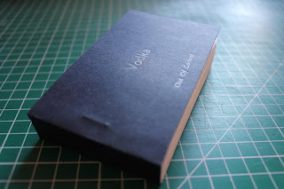
One thing that I am particularly pleased about is outcome of the covers, I think that choice of navy blue over black or white, gives it a less harsh look but still looks neat and sophisticated. I also think that the use of the silver ink works really well against the navy blue paper, and again isn't as harsh on the eyes as white would be. I really love how the printing process gave an indentation of the lettering into the paper, giving it a tactile dimension to it.  

Self-directed: "Out Of Control" - Final Flip Books

My Final Pieces


Friday 27 April 2012

Self-directed: "Out of control" - The making

The books before they had the covers on.


I chose the size of the flip books to be able to fit easily into the palm of one hand and flicked with the other. I decided that A7 would be the perfect size for the flip books, the pages in the end were a bit longer than an A7 page because I put a tab on the left hand side, so that images wouldn't be hindered when being bound and so that the audience has enough space to hold the book when flipping. The final books were abit abit thinner than A7 after trimming, but I left space at the top and bottom of them images specifically for that, so none ofthe image would go missing.

I originally planned to staple all the pages of one book together with an industrial staple, and I went to staples and they told me that it was possible for them to do that there and to come back when I was ready with my work. But in the end they weren't able to staple them all in one go but in about four goes. As I had no time to try and fix this by finding a place that was able to staple it or another method of binding it. So I made do and stapled it in small groups and then glued the individual groups together to make the book. I then trimmed the back bind so it was all straight and then set it with glue again, along the new flat bind. After it had dried I then trimmed the edges so that it was all need, easy to flick and all 90 degree angles. 


The covers

For the covers I decided to use the Letter Press to print the type, because I liked the tactile feel it gives because it slightly embosses the paper. I also chose this method of printing because I have never used this technique properly before and wanted to challenge my self to something new. 

The paper I chose was 150 gsm navy blue. I thought this colour looked more sleek and sophisticated than choosing a bright colour or a recycled paper brown, etc, but also less boring than just plain white or black. I did compare different white to see if they gave the books a different feel, the slight differences made them look just dirty. 

I decided to go with a silver coloured ink because I didn't want to go with what I would consider the norm by choosing white, and I think the silver compliments the navy blue paper with its tint of blue in it.

I chose the layout of the of the type to sit this way so that when I cut it to fit the books, the title of the each book, i.e. Vodka, will sit directly in the middle of the front cover and the title of the project, Out Of Control, will sit, small, at the bottom but in the middle of the page. I wanted to keep the print simple so that it wont take away from content in side and so that it would look sleek and sophisticated. 


Wednesday 25 April 2012

Self-directed: "Out of control" - Lemon

Here I have documented different peoples reactions to eating a lemon. I recorded them in front of a white screen and focused mainly on their faces so that I capture their responses as clearly as possible. I couldn't have the camera too close to their face because they move and in turn move in and out of the frame.

This would have been a great reaction to the lemon if it had not been the dramatic move in and out of the frame.
I think that the above is the best reaction to the taste of lemon.


Self-directed: "Out of control" - Chilli

Here is the unedited footage I took of different people's reaction to eating chilli, I shot them in front of a white screen and focused mainly on their faces.

I found the above reaction most amusing and I am going to use it as the footage for my flip book. though I am definitely going to have to cut it down to a few seconds of the initial reaction because 1 min long is far too long for a flip book.

It very interesting how some people's reaction to a small amount of chilli is just as bad as some peoples to a lot of chilli or a stronger chilli.


Self-directed: "Out of control" - Onion

Here I have documented different people's reaction to eating onion.


I think the above reaction is the best because she has one of the strongest reactions.

This would have been a good reaction if it was actually the reaction to the flavour of the onion, not the reaction to the onion hitting his filling and causing him pain.


I have notice that a lot of people in the videos, when they are put in front of a camera, feel the need to smile and laugh, even myself included. I think it is due to the need to regain some control and are worried about their "out of control" face, Even nervous laughter because of the same reason.

Self-directed: "Out of control" - Vodka

Here are my unedited footage of different people reactions to drinking a small shot of vodka. I shot them in front of a white screen and focused mainly on their faces so that I could capture their expressions as well as possible, but not too close because as they move, due to their reaction, they might go out of frame.


The videos above and below are a little bit out of focus which I didn't see through filming so they continue like this into the other reactions.


This person above's reaction to the vodka is pretty useless, either she was holding back her reaction or she is so used to the vodka it didn't have the same effect as it would normally.


The above reaction to the vodka was made a bit void because he was still reacting the chilli he had just eaten not long before, at this point I swapped the vodka to before the chilli so it wouldn't happen again.


 I think this is the best vodka reaction because it is quite a big and quick expression.
I will use this as the footage for my flip books.